
Fracture Remodeling App
Improving patient education through research
Overview
The Fracture Remodeling App is an interactive patient education tool that visualizes how a young child's fractured forearm can naturally realign as it heals overtime. Before development began, I conducted clinical observations to better understand the problem and initially recommended against building a dedicated application. When the project moved forward, I evaluated their existing prototype, identified usability opportunities, and partnered with the team to refine the experience before usability testing.
The Problem
The human body is incredible. In young children, some fractures can completely realign and heal on their own through a natural process called “fracture remodeling,” eliminating the need for surgery or other medical interventions. While this is remarkable from a medical perspective, it can be difficult for families to understand. Imagine being an orthopedic surgeon explaining to the parents of a 3-year-old with a broken forearm that no surgery is needed and that their child's bone will gradually heal itself over time.
Helping families trust a treatment plan often requires more than just words.
The Solution
To support these conversations, an orthopedic surgeon at Children's Mercy Hospital envisioned an interactive tablet application that uses patient-specific fracture details and 3D visualizations to demonstrate how a child's bone is expected to heal over time.
My Involvement
I conducted clinical observations, evaluated an existing prototype through a heuristic evaluation, translated research findings into design recommendations, redesigned and prototyped the application, and collaborated with the team to prepare it for formal usability testing.
Methods
Clinical Observations · Heuristic Evaluation · Wireframing · Prototyping · Usability Testing · Iterative Design
My Role
UX designer · UX researcher
Team
UX Specialist · Pediatric Orthopedic Surgeon · Developer · Trinity Animation Studios · Project Manager
Project Timeline
Clinical Observations → Problem Discovery → Existing Prototype Heuristic Evaluation → Redesign & Prototype → Usability Testing → Iterate
Challenge
When I joined the Fracture Remodeling team, an initial prototype of the application had already been developed. I was originally brought in to conduct usability testing, but after reviewing the application, I determined that several usability issues needed to be addressed before testing could provide meaningful insights.
I conducted a heuristic evaluation, translated my findings into prioritized design recommendations, redesigned and prototyped the application, and collaborated with the team to implement improvements before we begin formal usability testing.
Our goal was to create an intuitive patient education tool that helps clinicians explain how pediatric forearm fractures can naturally heal without surgical intervention. The application is currently undergoing usability testing with clinical staff at Children's Mercy.
Design Process
Step 1: Define the Problem
Clinical Observations
Before development of the Fracture Remodeling App began, I was asked to better understand the communication challenges surrounding pediatric fracture remodeling. To do this, I observed an orthopedic surgeon and clinical staff for 20 hours over five days in their outpatient clinic, watching how they explained the healing process to patients and families.
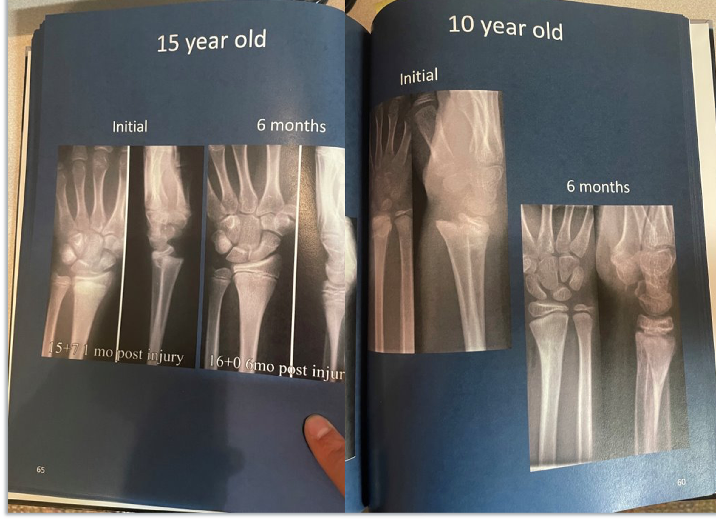
During these observations, I saw clinicians rely on patients' X-rays and the Fracture Healing in Children book to explain how certain forearm fractures naturally heal without surgery. While some families remained hesitant, the combination of visual aids and conversations with the orthopedic surgeon effectively addressed most questions.
Based on these observations, I recommended against developing a dedicated tablet application. Given the effectiveness of the existing educational materials and the projected development costs, I believed the problem could be addressed without building a new digital solution.
Several months later, the project moved forward as an interactive tablet application. Once an initial prototype had been developed, I was brought back into the project to evaluate the user experience, identify usability issues, and prepare the application for formal usability testing. My role shifted from determining whether a digital solution was needed to ensuring the experience justified building one.
Fracture Healing in Children Book
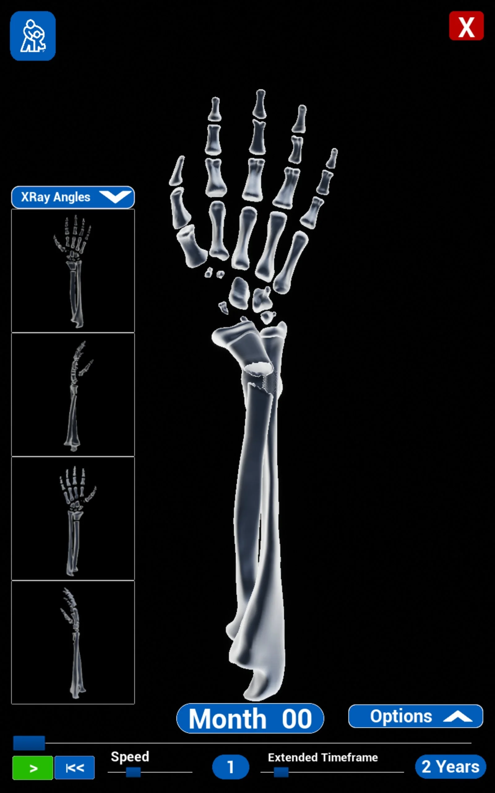
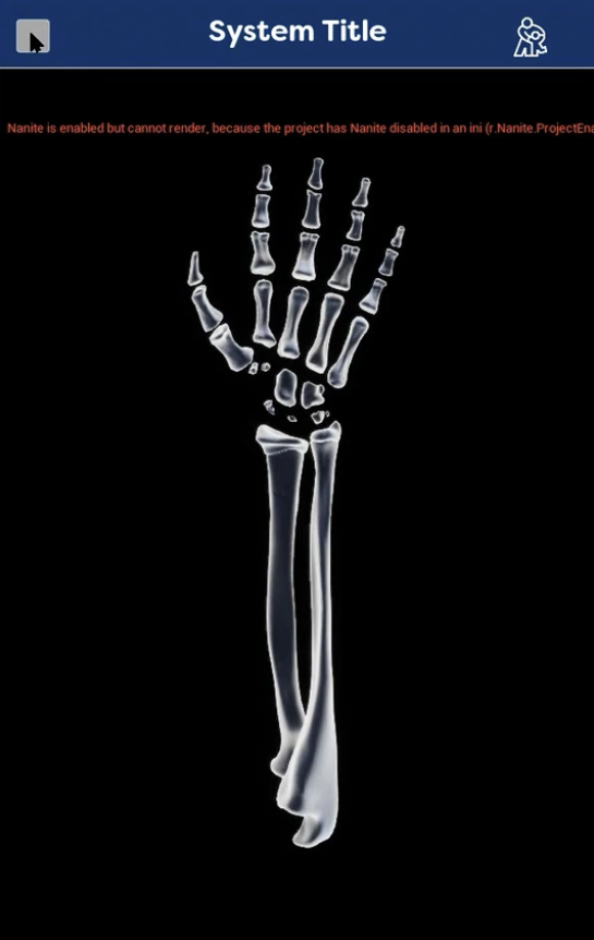
Fracture Remodeling App Before UX Heuristic Evaluation
Right Menu Expanded
App Home Screen


Fracture Angle Entry Overlay
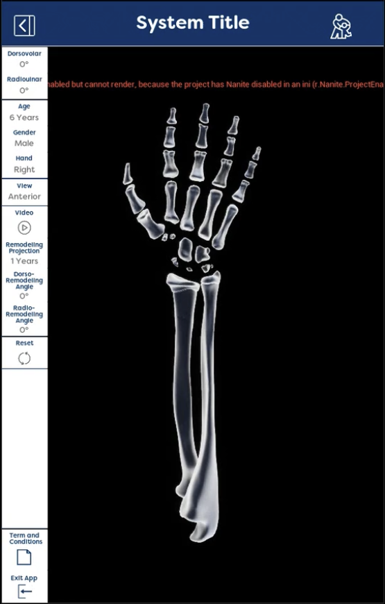
Left Menu Expanded

Research
Step 2: Research
When I rejoined the project, an initial prototype had already been developed. Rather than proceeding directly into usability testing, I first evaluated the experience to ensure we were testing an interface that reflected UX best practices.
Heuristic Evaluation
I conducted a heuristic evaluation using Nielsen Norman Group’s 10 usability heuristics to identify usability issues, prioritize design opportunities, and provide recommendations for improving the overall experience.
Evaluation Task - Display the distal radius fracture over time for:
4-year-old patient
Male
5-year healing period
Right hand
30° dorsovolar fracture
40° radioulnar fracture
Heuristic Evaluation Findings
The initial prototype successfully demonstrated the potential of using 3D visualization to explain fracture remodeling, but the evaluation revealed several usability opportunities before testing with clinicians could be valuable.
Hidden Controls Increased Cognitive Load
Important customization options were hidden within expandable menus, requiring users to remember where specific settings were located.
I recommended making key actions more visible and organizing controls around the user's workflow.
Terminology Did Not Always Match User Expectations
Several labels used technical language or unclear terminology, making it difficult to understand the purpose of certain features.
I recommended simplifying language and aligning labels with users' goals.
Interactive Elements Needed Better Guidance
The prototype included valuable 3D interactions, but users were not always aware of available actions.
I recommended adding clearer visual cues and improving the discoverability of interactive features.
Design Process, Cont.
Step 3: Ideate
Based on the heuristic evaluation findings, I developed prioritized design recommendations to address usability concerns and improve the overall workflow. After reviewing these recommendations with the internal Children’s Mercy team and collaborating on potential solutions, I began sketching and exploring different design concepts.
The primary goal was to create a more intuitive experience that guided clinicians through creating a patient-specific fracture visualization while reducing unnecessary cognitive effort.
Key Insight!
While my initial research revealed that the existing education process was effective, but the team continued exploring a digital solution. When I later joined the project, I used the existing prototype as an opportunity to apply research-driven design improvements and evaluate whether the tool could better support clinical conversations.
Design Decisions: Improving Information Hierarchy
Challenge
The heuristic evaluation revealed that the initial prototype contained several usability issues that made the application more difficult to navigate than necessary. Important controls were hidden within expandable menus, technical terminology was not always intuitive, and the workflow required clinicians to spend more time operating the application than explaining fracture remodeling to patients and families.
Insight
The final interface design should support—not compete with—the clinical conversation. By making important controls easier to find, simplifying patient information entries, and organizing the experience around our clinicians' natural workflows, users could spend less time navigating the application.
Design Decisions
Improve Information Hierarchy
The original prototype relied on multiple expandable menus that made important controls difficult to discover.
I reorganized the interface to prioritize the most frequently used controls and created a clearer visual hierarchy.
Simplify Data Entry
Entering fracture details required navigating several menus and a large numeric input panel that interrupted the workflow.
I redesigned the input experience to make patient information and fracture measurements easier to enter and view while keeping the 3D model still visible.
Increase Visibility of System Status
Key information, including fracture measurements and animation controls, was difficult to locate and interpret.
I redesigned these elements to provide better visibility and clearer feedback as users adjusted the model.
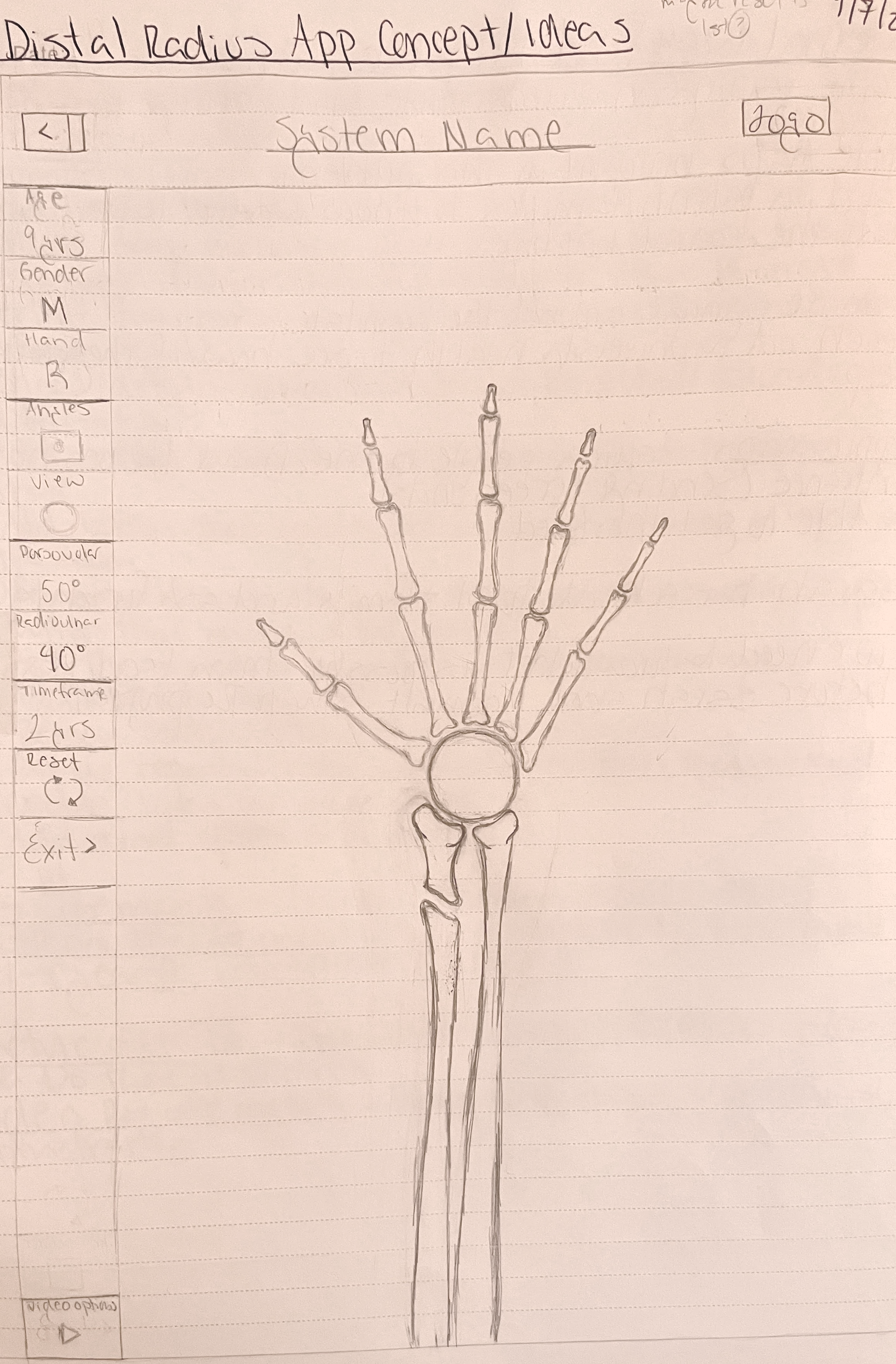
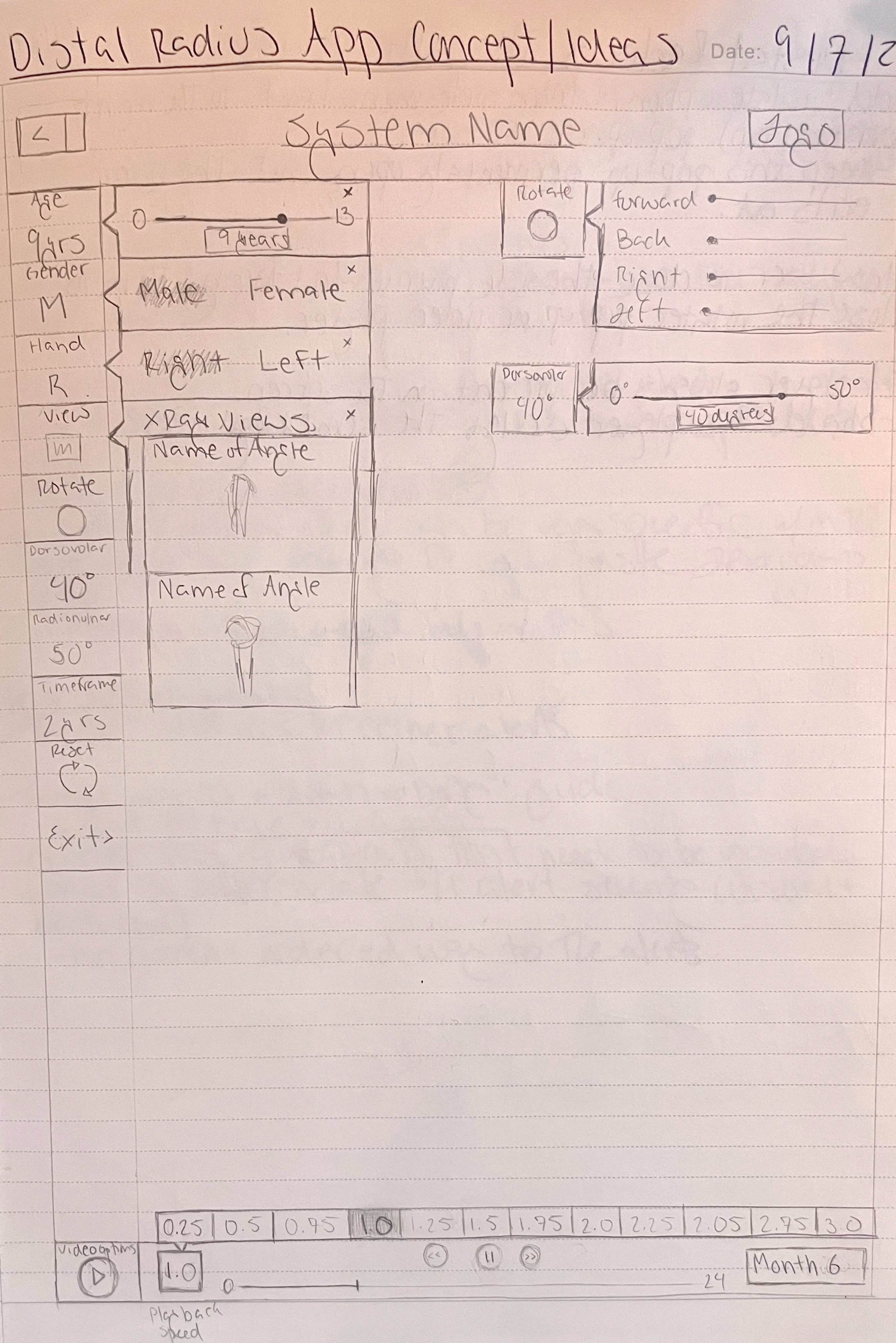
Fracture Remodeling App Concept Sketches
Step 4: Prototype
I created wireframes and a prototype to communicate the recommended changes and evaluate potential solutions with the team. The redesigned experience focused on improving information hierarchy, making actions and entries easier to find, and creating a clearer workflow for generating fracture visualizations.
Step 5: Iterate
The updated prototype was developed and deployed onto two Samsung tablets in preparation for usability testing. Before testing began, I identified several areas to validate with clinicians and incorporated these questions into the usability study plan.
Key areas for evaluation included:
Input Placement
The location of the dorsovolar and radioulnar degree inputs may not align with users' expectations.During testing, I plan to evaluate whether clinicians understand where to enter this information and whether the placement should be adjusted.
Menu Organization
The current menu structure may benefit from additional spacing and grouping to improve readability and navigation.Usability testing will help determine whether further organization is needed.
Speed Controls
Team members and developers identified that the purpose of the speed increase/decrease controls may not be immediately clear.Testing will evaluate whether users understand this functionality and whether additional guidance or design changes are needed.
Step 6: Usability Testing
Usability testing is currently in progress with clinical staff at Children's Mercy. At this stage, the application was not yet fully complete, but it contains the core functionality needed to evaluate the user experience. As usability testing continues, the team will use research findings to further refine the experience and ensure the application is ready for clinical use.
Conclusion
Although my initial research suggested a digital solution might not be necessary, once the project moved forward my focus became ensuring the application was intuitive, efficient, and effective for clinicians. This project reinforced the importance of letting research guide design decisions, even as project goals and priorities evolve.
Fracture Remodeling App After UX Heuristic Evaluation - Redesigned
App Home Screen - Menu Hidden
App Home Screen - Menu Expanded
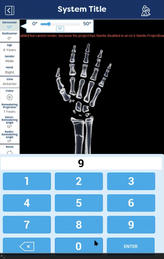
Fracture Angle Entry Expanded
Fracture Angle Entry Overlay
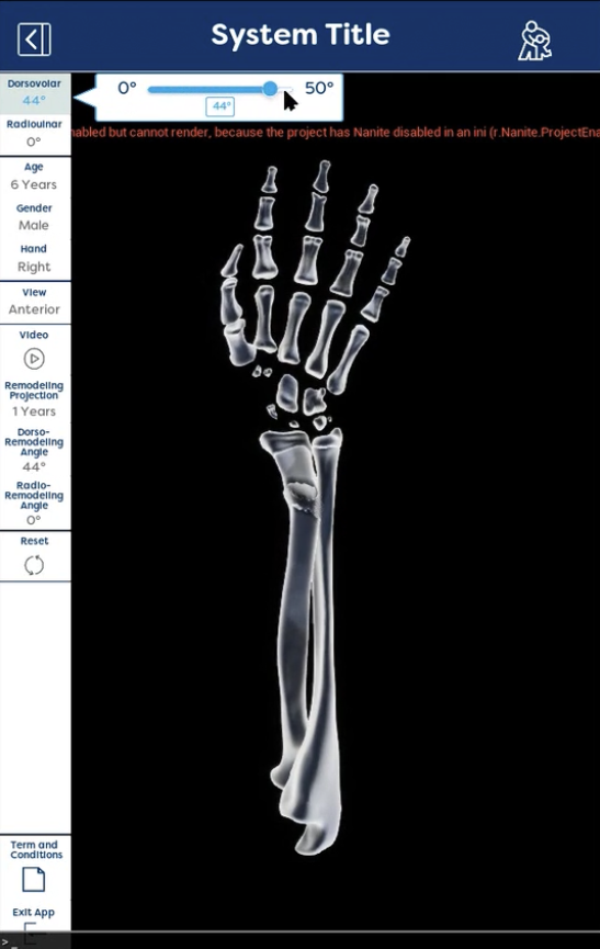
View a demonstration of the Fracture Remodeling app, showcasing how clinicians can visualize fracture healing and explain natural bone realignment to patients and families.