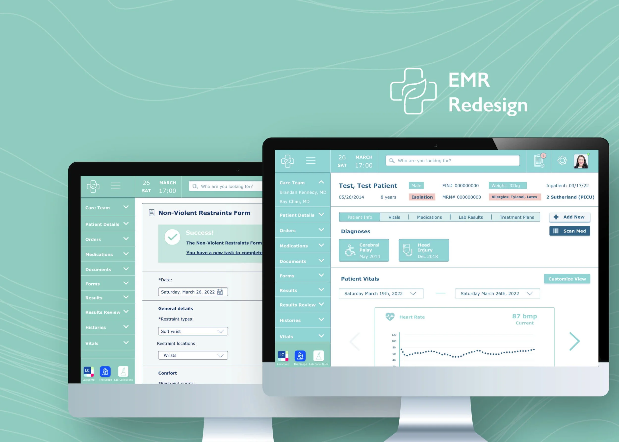
EMR Redesign for Pediatric Nurses: Design that Works
Overview
Children’s Mercy Hospital (CM) nurses use an electronic medical record that is not user-centered or easy-to-use. The system contains many usability issues and nurses struggle to complete tasks efficiently.
One of the most frequent tasks completed by nurses at CM is documentation. Otherwise known as creating an ad hoc form. These forms are added to a patient’s chart and used to document admission, discharge, education, restraints, etc.
What is an Electronic Medical Record (EMR)?
EMRs replaced the original paper patient charts. They are used to care for patients, order medications, communicate with patients, and much more.
Research Question
Will the redesign of the EMR increase usability and ease-of-use for pediatric nurses?
Design Objectives
Understand: Identify nurses’ needs. Understand the EMR and features for opportunity
Redesign: Enable nurses to easily accomplish necessary tasks (complete ad hoc documentation) through an EMR redesign
Increase Usability: Create a more user-friendly system for pediatric nurses
Roles
UX researcher, UI designer, project manager
Tools
Literature review, persona, journey mapping, survey, usability review, UI/UX design, data analysis
Duration
4 months in 2022 (Master’s Thesis)
Design Challenge
For my Mater’s thesis, I decided to redesign the most frequently used and complex feature for nurses in the EMR currently used at CM.
Based on the results from my survey, 56 nurses determined that they use the ad hoc forms (patient documentation) feature most frequently. As a result, I set out to determine the main issues with the ad hoc form process, and redesign the ad hoc form process.
Research
Step 1: Literature Review
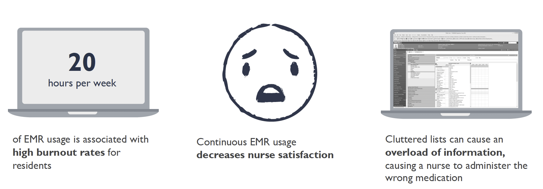
First, I conducted a literature review for journey articles on the use of EMRs and found some staggering data.


Step 2: Persons
Next, I created a series of direct care nurse personas and a journey map, to identify user needs. Each persona contained their unique characteristics, history using EMRs, redesign solutions, and problems.
For example, Martha: is 58 years old, has been at CM for 30 years, and has used the current EMR for 30 years.
Martha’s Problem Statement: Martha has watched the EMR evolve. She knows where everything is in the current system but has multiple workarounds to successfully complete her daily tasks. Although Martha is an EMR wizard, she still struggles to complete some forms (documentation), as each form layout is different.
Potential Design Solutions for Martha: eliminate the need for workarounds and create ad hoc form consistency
Step 3: Engage Nurses
Survey CM nurses to identify the current EMR’s most complex and frequently used feature. 56 direct care nurse (nurse who works at the bedside and provides direct patient care) from CM completed an online survey.
Nurses were given 3 weeks to complete the survey. Participants were asked to rank which 5 features in the current EMR are most complicated to use and most frequently used.
The results showed that ad hoc forms (nursing documentation) were the most complex and the third most used feature in the EMR. As a result, the focus on this study was to redesign the ad hoc forms process.
The survey also collected demographic information from the nurses.
Step 4: EMR Usability Review & Journey Map
A usability review is a process to examine the usability of a system by comparing it with a set of best practices/general heuristics. With the help of two pediatric intensive care (PICU) nurses, I wrote 3 ad hoc form-related scenarios (and 4 tasks). Each task was completed in the current (and after the redesign, the redesigned) EMR.
The first scenario/task focused on simply locating a form from the nursing form list. This form is tucked inside the “Nursing Forms” folder in the current EMR, requiring nurses to recall where to retrieve the document. The current EMR does not allow users to search for documents, and instead, clinical staff must remember what folders contain what forms.
The second scenario/tasks focused on completing the non-violent restraint form in the EMR. The tricky bit of the non-violent restraint forms, are that, nurses must complete one of these forms every 2 hours, until their patient is out of restraints, to ensure the patient is safe. Unfortunately, the current EMR does not remind nurses to complete this recurring form, which requires increased cognitive load on the nurse, since s/he must remember to complete the same form multiples times during their shift.
The third scenario/task focuses on locating and completing an education form for a patient. These forms are notoriously difficult to find in the current EMR and are often left incomplete.
The two PICU nurses and I (separately) completed the tasks within the current EMR. After completing the tasks we each (individually) rated the EMR based on a series of pre-determined heuristics/best design practices. Each heuristic was weighted based on its significance to the final usability review score.
Usability Review Scores (out of 100)
Rating scale: Very Poor (<29), Poor (29-49), Moderate (49-69), Good (69-89), Excellent (>89)
Me - 48 (poor)
PICU Nurse #1 - 53 (moderate)
PICU Nurse #2 - 57 (moderate)
Average - 52.67 (moderate)
EMR Usability Review Process


Journey Map
Non-Violent Restraint Form (Page 1)

Rating Scale for Usability Review
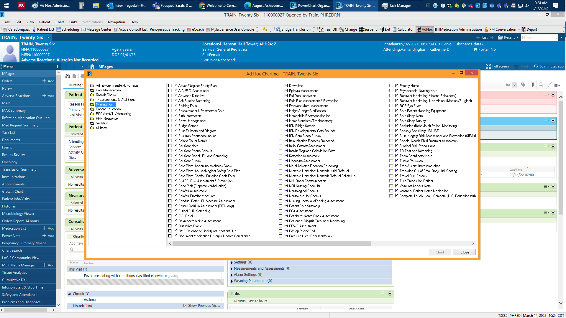
Ad Hoc Forms - Nursing Form folder
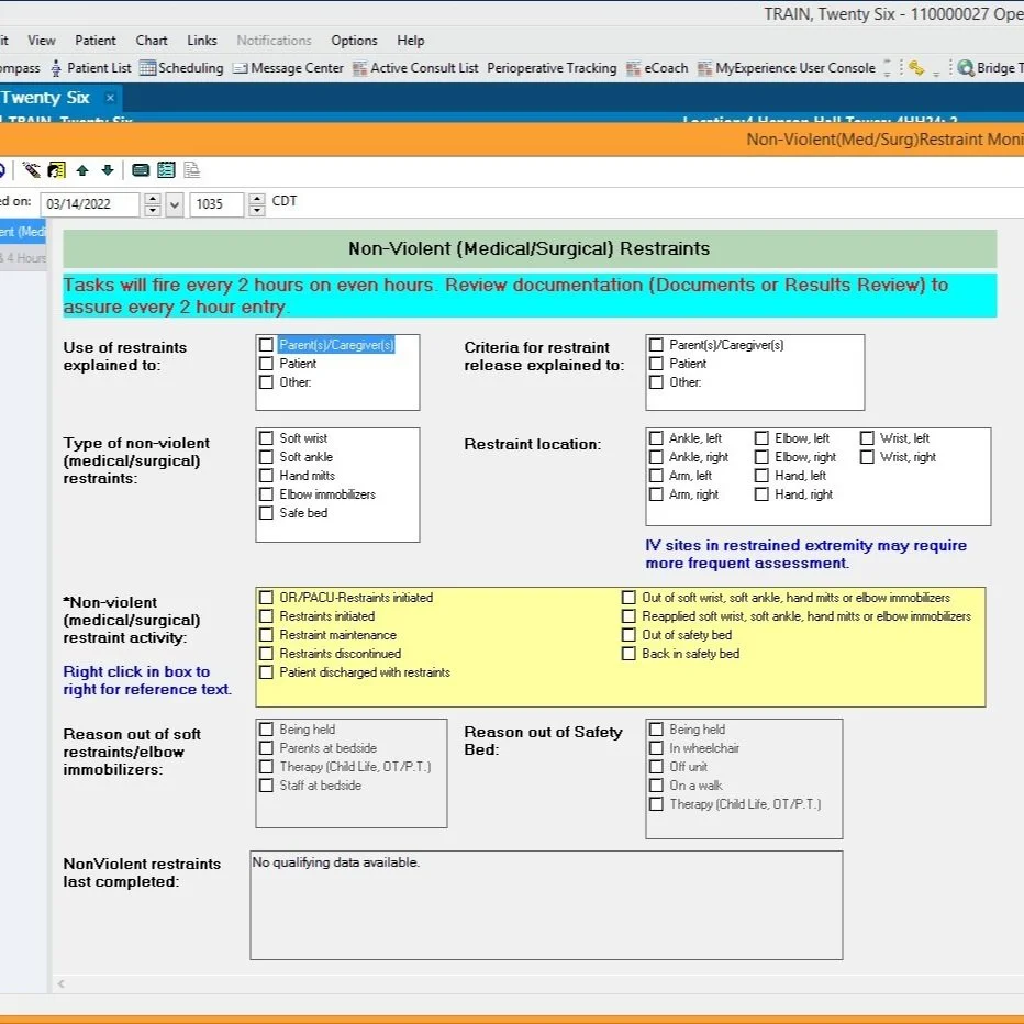
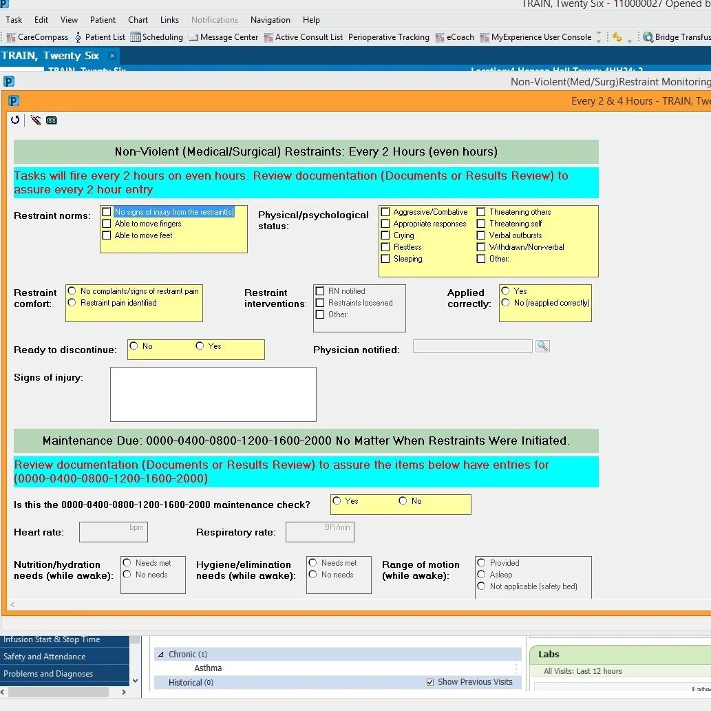
Non-Violent Restraint Form (Page 2)
Step 5: Prototype
Based on the results from the usability review, I redesigned the ad hoc forms process within the current EMR. Once my design was complete, the two PICU nurses and I conducted the same usability review as we did with current EMR on this new design. My goal for the redesign was to reach a “Good” rating (69-89) on the usability review rating scale (above).
For each scenario/task, I redesigned a portion of the current EMR. This included the patient summary page, the process for locating a form, adding a form search function, developing automated reminders, providing error messages, and showing visual confirmation after user actions - all features which the EMR lacked.
Step 6: Usability Review Comparison Scores (out of 100)
Once the EMR prototype was complete, I recorded each scenario/task within the redesigned EMR. The two PICU nurses I worked with throughout my project completed a second usability review, using the same rating scale).
Very Poor (<29), Poor (29-49), Moderate (49-69), Good (69-89), Excellent (>89)
The results from the redesigned EMR usability review are as follows:
Me - 77 (good)
PICU Nurse #1 - 87 (good)
PICU Nurse #2 - 95 (excellent)
Average - 86.33 (good). This exceeded my original goal (good)
Conclusion
I successfully met all three of my design objectives (understand, redesign, and increase usability).
In the future I hope to share the survey results and suggestions with CM leadership, make cahnges to the redesigned EMR based on findings from this study and from the two PICU nurses who helped me with my project, and conduct usability testing of the design, once updated.

Task 1: Find the Admission Database Form
Task 2: Complete the required documentation for restraining a non-violent patient.
Task 2.5: You realize it has been more than 2 hours since you first restrained your patient, you need to complete a second non-violent restraint form.
Task 3: Document the G-tube education you provided.