MyHeartArt: Before & After UX Intervention
The Problem
Imagine you’re a heart surgeon. Your patient is a newborn baby girl with a life-threatening heart defect. Your first job is to explain how you will fix her heart to her brand new (and terrified) parents.
How would you:
Explain to her parents what is wrong with their baby girl’s heart?
Explain to her family how you intended to fix their baby’s heart?
Most surgical teams rely a lot on trust or crudely, hand-drawn images. Some organizations have access to systems such as Microsoft Paint to visually explain heart defects. However, these resources are outdated and difficult to master.
The Solution
As a result, MyHeartArt was developed to assist cardiology teams to educate parents/caregivers about patients’ heart defects and potential surgical interventions.
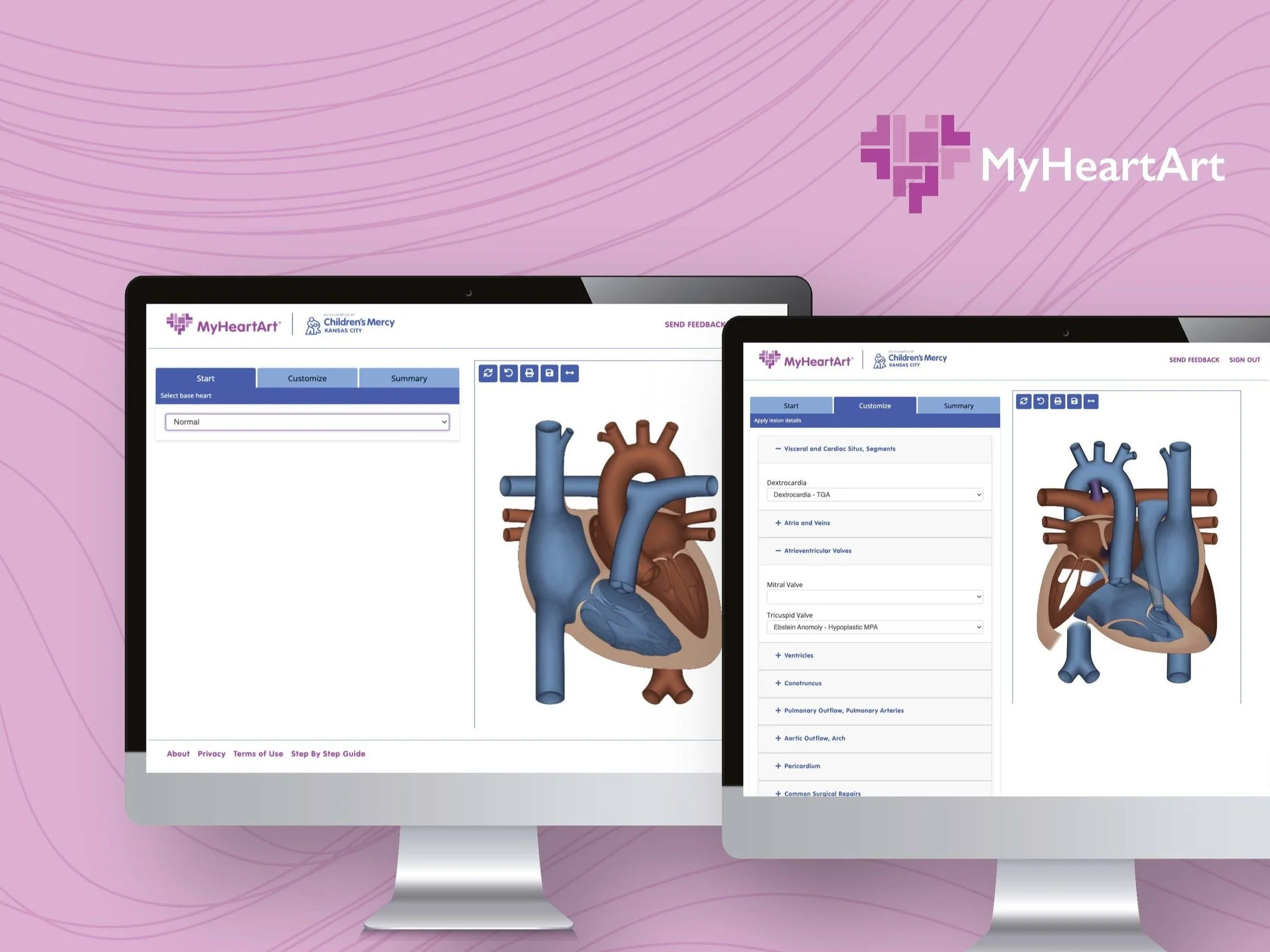
MyHeartArt is a web-based tool, conceptualized by two cardiology nurses from Children’s Mercy Hospital Kansas City (CM). This system allows anyone on the patient’s care team to efficiently create an anatomically correct rendering of a patient’s congenital heart defect. The system can illustrate the anatomy of the heart, cardiac shunts, mechanical valves, stents, blood clots, and over 100 other ways to edit the heart.
MyHeartArt creates an anatomically correct rendering of a human heart, which can be shown to families in an effort to create a shared understanding between the family/patient and care team. These renderings can be printed and sent home with families.
My Involvement
I was brought in to conduct usability testing and provide design suggestions, once the CM team had a working prototype of MyHeartArt.
Roles
UX researcher, UI designer, project manager, voice of reason
Tools
Usability testing, UI/UX design, data analysis
Duration
2 years (2021 - 2023)
Design Challenge
Before MyHeartArt, care teams would use Microsoft Paint or hand drawings to create basic heart diagrams. These templates were used to show patients and families what the patient’s heart looked like and what changes would be made to the heart during surgery. These renderings were often very crude and difficult to understand. Additionally, these renderings took a great deal of skill to create, and were extremely time consuming to generate.
As a result, a pediatric, cardiac nurse at CM decided that she would develop a tool to quickly generate these heart diagrams. She worked closely with CM’s Innovation Center, and contract developer until she had a first draft mock up.
Current heart diagrams can cause parents and care teams to…
Be confused
Endure frustration
Feel rushed
Have unclear clinical direction
The new program must be…
Web based
Intuitive
Easy-to-use
Easy to understand
Quick to produce heart diagrams
Remember Microsoft Paint?
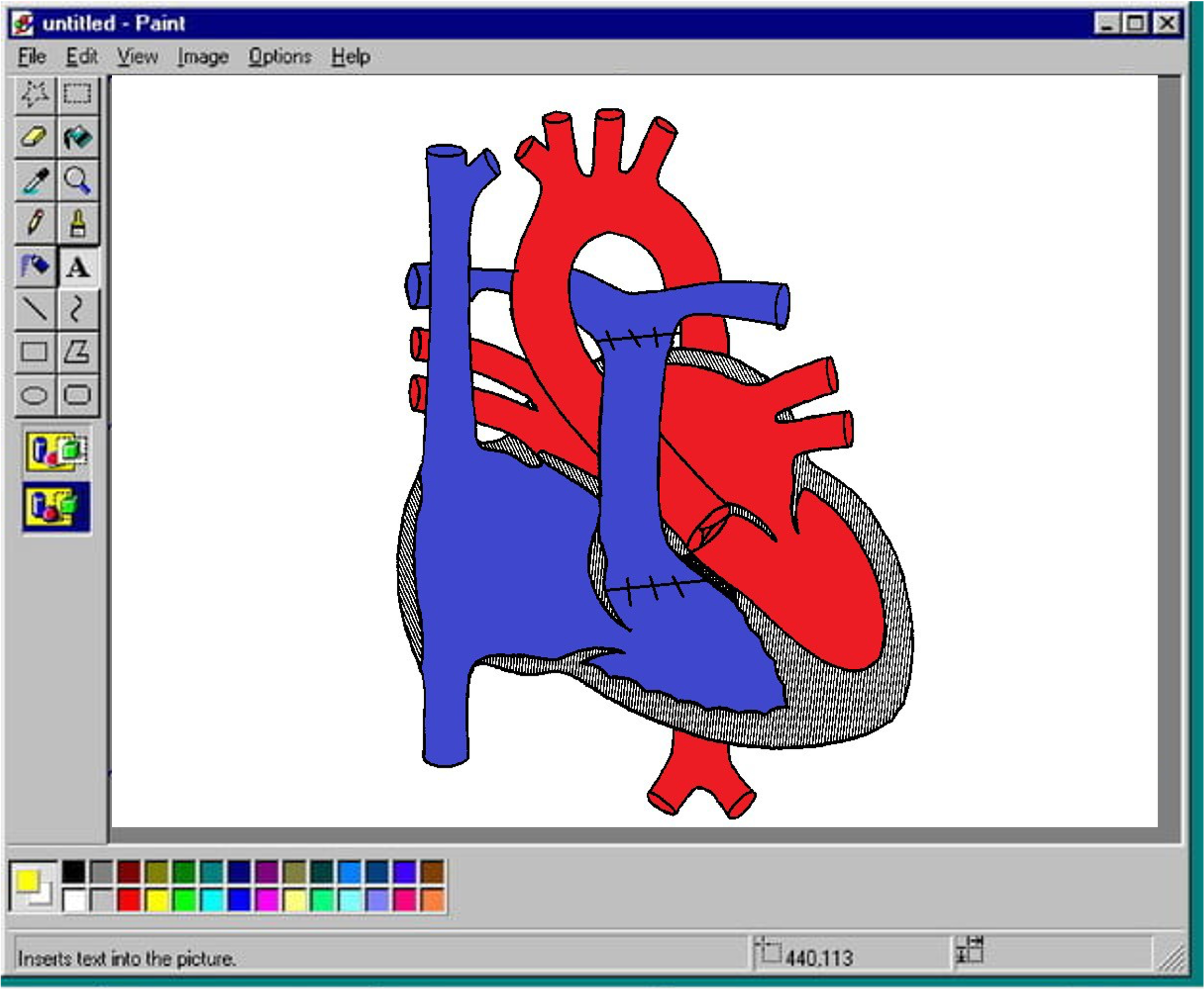
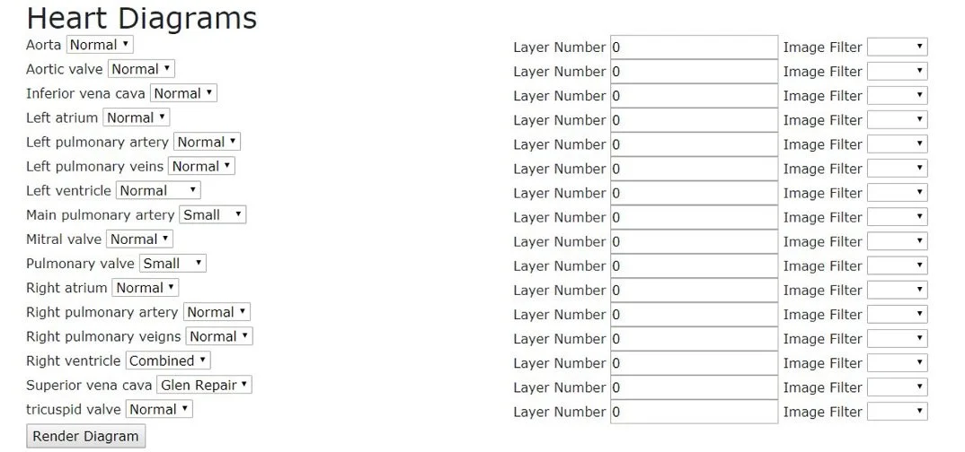
First Draft of MyHeartArt (before UX involvement)
Design Process
Step 1: Define the Problem
When I joined the team, I was thrown into the deep end, since they already had an existing system and concept of what the problem they were trying to solve was. To start, I asked a lot of questions about the purpose of this project, who the potential end users were, and what the users would want most from of this system.
The good thing was, this team was surprisingly good at focusing on the end users’ needs and were able to define the problem extremely well on their own before I joined the team. They defined their issue as an inability to visually educate parents/caregivers about patients’ heart defects and potential surgical interventions.
Step 2: Research
Since the first draft of MyHeartArt was already in existence when I was pulled in, I started my involvement with an informal heuristic evaluation, followed by multiple rounds of usability testing. After my heuristic evaluation, I made some suggestions to improve the overall design and the developer made the changes. Once changes were complete, my boss (a Human Factors Scientist), the two cardiology nurses, and I got together to write a series of scenarios and tasks for usability testing.
I’ll skip over the first round of changes I suggested after my heuristic evaluation, and the first round of usability testing, simply because the final round of usability testing was the main show stopper. We submitted this project through CM’s internal review board (IRB), as well as shared our findings at a few conferences, so this portion of the study has the most interesting and robust data.
Usability Testing #2
Purpose: evaluate the strengths and weaknesses of MyHeartArt
Participants: 10 people (who were familiar with Microsoft Paint as a heart diagram creator and comfortable creating complex heart diagrams)
Methods: first impressions, usability testing with 3 unique tasks, measuring task difficulty, confidence completing tasks, time to complete tasks, likelihood of use, ease-of-use, and the NASA Task Load Index (TLX).
Participants were given 30 seconds to engage with the system and then asked to rate the website on their first impressions (design, layout, attractiveness, and ease-of-use). Next, participants completed 3 unique tasks in both the MyHeartArt system and Microsoft Paint. Tasks were presented in the form of echocardiogram reports (documents detailing the summary of the cardiologist’s findings from an ultrasound of the heart). Participants were instructed to use the echocardiogram (echo) reports to create a unique heart diagram (3 total diagrams using both systems).
Participants were evaluated on task performance (pass/fail) and were asked to rate the task difficulty and their confidence completing the task after each task. One of the cardiac nurses from our team was responsible for determining if a participant’s final heart rending was correct, based on the echo reports they were given. The graphs below show the results for task performance, time on task, likelihood of use, and the NASA TLX.


Results
Task Performance
While there were no failures for the Paint diagrams (participants could get heart diagrams partially correct), 100% of the participants successfully completed the first task (echo report 1) in MyHeartArt.
MyHeartArt - Heart #2 Partially Correct
5/10 participants could not change the pulmonary atresia
MyHeartArt - Heart # 2 Failure
1 participant made the right ventricle thicker and was unable to change the pulmonary atresia
MyHeartArt - Heart #3 Partially Correct
3 participants could not find the VSD patch
1 participant could not edit the pulmonary artery
1 participant’s final image had the atrium only partially correct
MyHeartArt - Heart # 3 Failure
Participant could not find conduit/VSD patch. They changed the atrium wall color to purple to show closures, which was incorrect
Average Time to Complete Task
The most notable takeaway from this research was that participants completed every heart rendering in MyHeartArt in half the time it took them to complete the same renderings in Microsoft Paint.
At this stage, our team knew there were design changes that needed to be made to the system, but the speed with which people found and completed the renderings in MyHeartArt was promising.
Additional findings:
Participants rated the design and aesthetics for MyHeartArt higher than Paint.
90% of participants stated they were more likely to use MyHeartArt compared to Paint to create future cardiac diagrams.
Results: Paint renderings vs. MyHeartArt rendering (Task 3 - Echo Report 3)


Results: Paint renderings vs. MyHeartArt rendering (Task 1 - Echo Report 1)
Results: Paint renderings vs. MyHeartArt rendering (Task 2 - Echo Report 2)

NASA TLX Results
The NASA TLX assesses workload during a task. Participants completed the NASA TLX after completing all three echo report renderings in Paint, and then again after completing the same three renderings in MyHeartAr. Survey results were equivocal for mental demand, physical demand, temporal demand, effort, and frustration.
Based on these results, and additional qualitative data (e.g., comments), the team knew we had necessary changes to make to the system.

Step 3 & 4 : Ideate & Prototype
Based on the results from usability testing, I created multiple (prioritized) recommendations for the team and developers to review. Collectively, the team went through the recommendations and decided which items were most important to change. Throughout this process, I created a few mockups for what the screens should or could look like, but the my prototyping for this project was very minimal. The (single) developer on the team was excellent and took my ideas and suggestions and turned them into what MyHeartArt is today.
Step 5: Iterate
While my involvement with this project has ended, the team is still making changes to the system every day (they occasionally reach out to me for design advice).
Conclusion
MyHeartArt has been live at CM’s cardiac clinics for over a year. The team continues to make updates to the system, based on live feedback from CM clinical staff. So far, the system has received rave reviews.
Now that the system is complete, the Innovation Center is marketing the website to other pediatric hospitals. The website is live at 5 other pediatric hospitals.
MyHeartArt before I became involved (before usability testing)

MyHeartArt after I was involved (after usability testing)


