Medication Reminders: A Redesign
Overview
Improve the usability and ease-of-use of the medication reminders set-up within the MyCare mobile app.
What is MyCare?
MyCare was designed by Children’s Mercy’s (CM) Innovation Team to provide a reliable medication tracking system for pediatric patients transitioning to adult care. While the app has other features, they are not relevant to this particular redesign project.
Roles
UX researcher, UI designer, project manager, prototyping, and testing
Tools
Heuristic evaluation, wireframing, usability testing, survey design, data analysis
Duration
1 month in 2020
Design Challenge
The medication reminders set-up in MyCare is overly complex and difficult to use. In my Master’s program, I was assigned to conduct a heuristic evaluation and usability test on an app of my choosing.
Because of my involvement with MyCare over the past few years, I well aware of the ongoing issues with MyCare’s medication Reminders. As a result, I set out to re-imagine the reminders home screen and creating a medication reminder.
Design Process
Step 1: Define the Problem (explained above)
Step 2: Research
My first step in the research process for this project was looking into competing mobile applications.
When I selected MyCare as my case study, I immediately investigated other mobile apps that have successfully developed medication tracking systems.
The purpose of this research was to gain a better understanding of what currently exists in the market and determine the most successful app features.


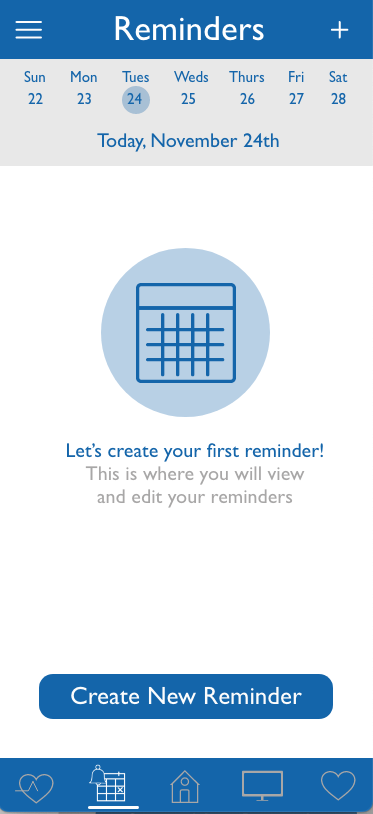
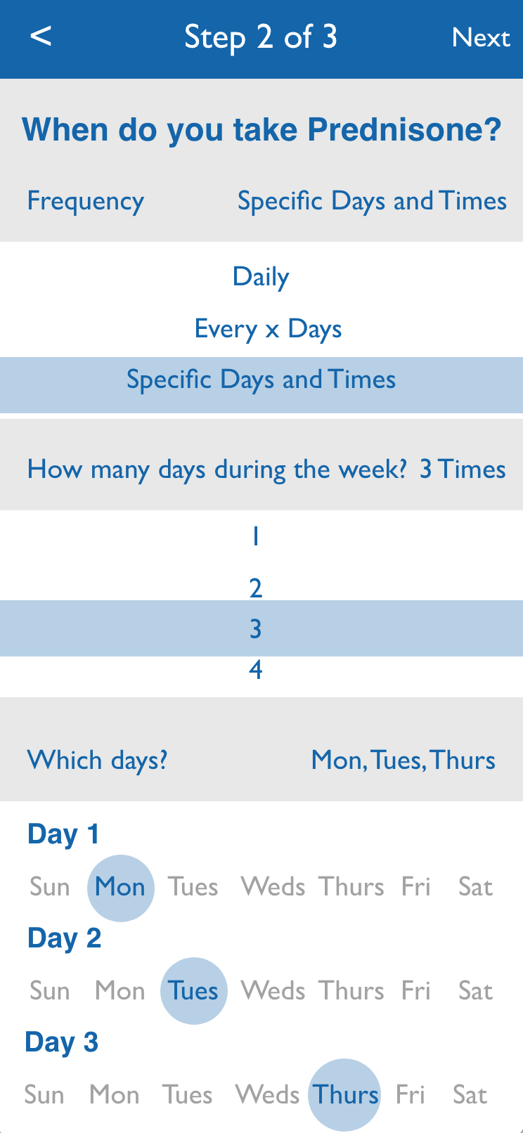
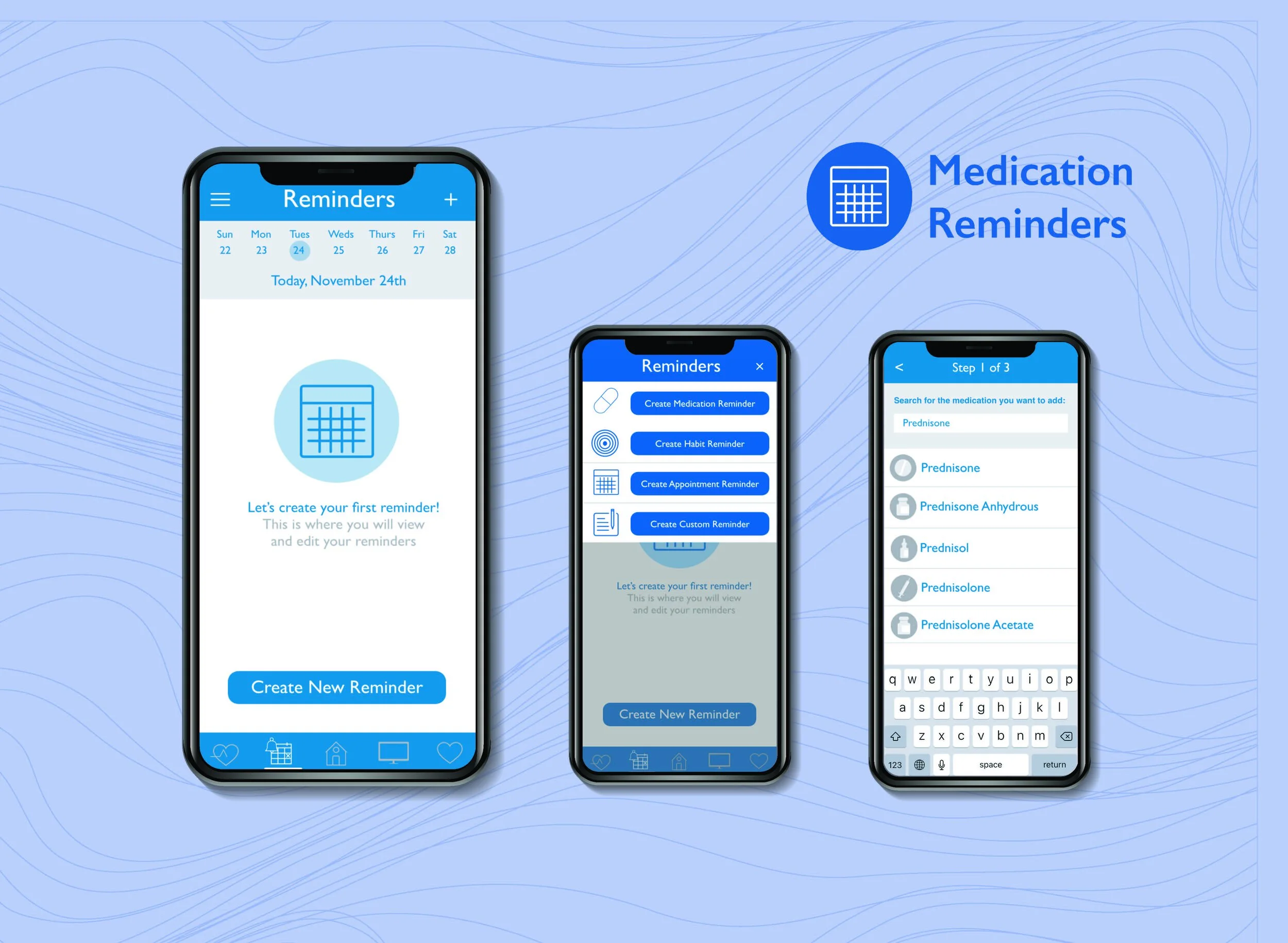
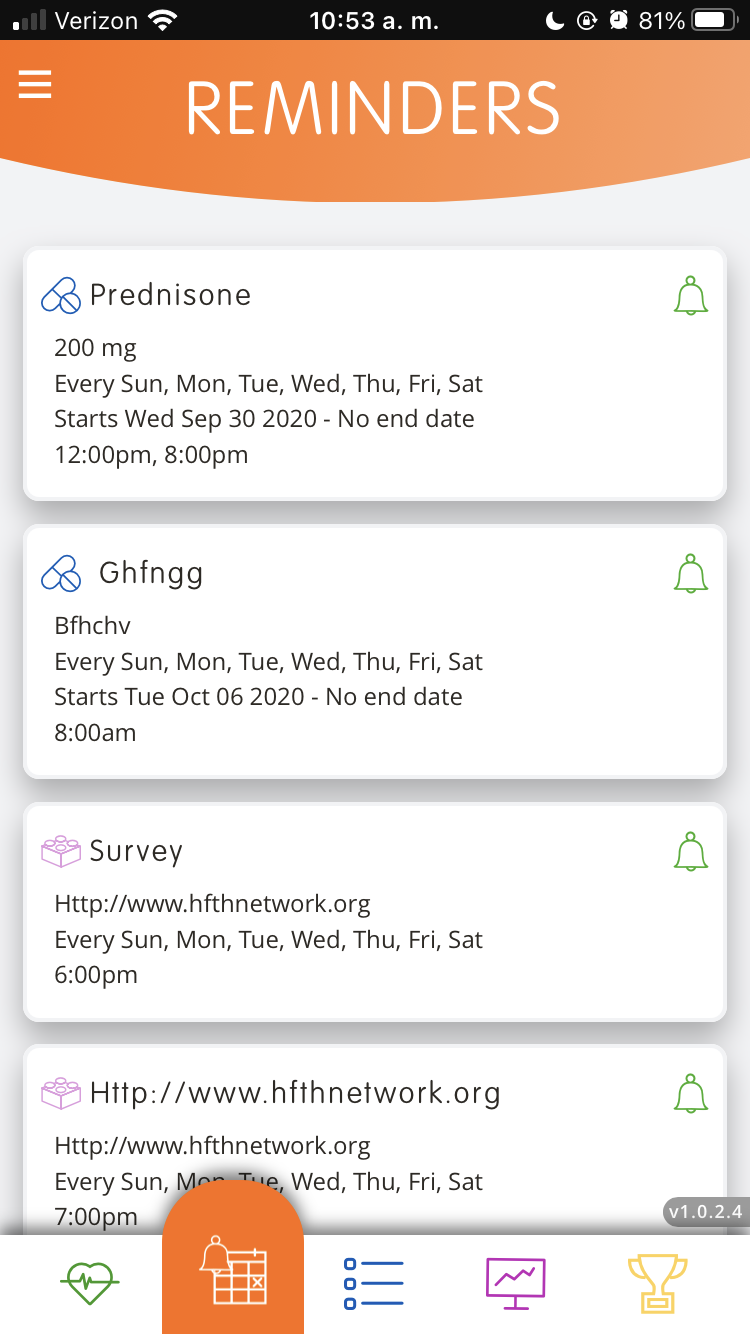
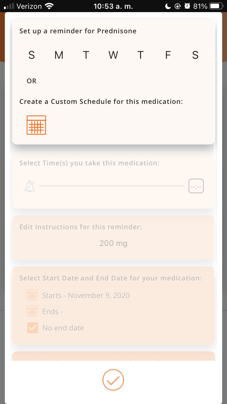
MyCare’s current medication reminder screens
Heuristic evaluation (HE)
The HE revealed 6 primary pain points within the Medication Reminders set-up. Based on these results, I made changes to the design and created a working prototype in Adobe XD.
Step 3 & 4 : Ideate & Prototype
1. Eliminate the “drawer”
2. Redesign the “save” (check) buttons to be more intuitive
3. Implement an easy delete Medication Reminder process
4. Create a more aesthetically pleasing design for young adults
5. Develop error messages (as there are currently none)
6. Provide a pre-populated medication list (to reduce typing or spelling errors)
Usability testing
After the new design was finalized, I conducted usability testing on both the original MyCare app and my prototype. I tested 7 participants. Participants consisted of 4 adults, one 11-year-old, and two 14-year-olds (pediatric patients are the target end users).
Usability testing consisted of first impression ratings, pass/failure of tasks, confidence completing tasks, ease-of-use for each task, completing the Systems Usability Scale (SUS), and comparative screenshot ratings.
First Impressions (design)
The overall first impression ratings for both the app and prototype were relatively similar. However, 4/7 participants stated that the prototype design was “boring” or less visually engaging than MyCare.
Identical Task Results
Participants completed 4 (almost) identical tasks in both the MyCare app and my prototype.
71.43% of participants failed all 4 tasks using MyCare, while 100% of the participants successfully completed 75% of the identical tasks using the prototype.
It took participants 50% less time to complete the tasks within the prototype, as compared to MyCare.
2 prototype tasks took 1/8 less time than the tasks in MyCare.
Systems Usability Scale (SUS)
SUS results showed an overall preference for the prototype. The prototype rated higher (closer to “Good” on the SUS Score), while MyCare was rated as only “OK.”
MyCare SUS Score: 52.50
Prototype SUS Score: 73.75
Comparative Screenshot Ratings
Specific changes were made based on the heuristic evaluation. My goal during usability testing was to compare the changes between the prototype and the current app.
Screenshots from the MyCare app and prototype were printed out. Participants were then asked to rate 6 screenshots (6 from MyCare and 6 of the same function from the prototype) on a scale from 1 - 100. The goal of this exercise was to visually show which navigation, aesthetic, design, color palette, etc. testers preferred.
The prototype rated higher across all 6 comparative ratings.
Comparative Screenshot Ratings
If there had been more time...
During the Comparative Screenshot Ratings portion of usability testing, I wish I had asked a question about the way the prototype guides the user through the medication reminder set-up, compared to the lack of guidance in MyCare. One of the primary differences between MyCare and the prototype were the questions asked during reminder set-up in the prototype flow. The prototype was designed to guide users through their medication entries using a series of questions, whereas, the current MyCare app forces users to struggle, click aimlessly, and figure out required information for themselves. As a result, I think this would have been a good comparative rating.
Only one task asked users to create a new reminder. If I had more time to create more prototype screens, I would have added a few more screens that guided users through creating an additional medication reminder. MyCare currently has this function and it would have been beneficial to test this process for both the app and prototype.
Test the app and prototype with more children. I think age plays a huge factor in learnability and discoverability for digital products. Since the app was originally designed with pediatric patients in mind, I would have liked the chance to explore their interactions with the prototype further.
Step 5: Iterate
Results from usability testing were shared with the MyCare developers, stakeholders, and CM Innovation Team. While the app was not updated (due to budget constraints), my design suggestions were taken into consideration.
Suggested changes to the prototype from usability testing will be made and a second round of usability testing may be conducted.
Conclusion
If the medication reminder entry process was revamped, MyCare would have the ability to empower young patients to succeed at their transition to adult care.
I have found with MyCare, the idea of the app is great. However, in its current state, it is almost unusable. The app has the potential to be a valuable tool for patients and families, it just needs a redesign.